Modeling Free Throws with the Binomial Distribution
On the opening night of the NBA, the Bucks and Celtics battled till the finals seconds in a nail biter. Jayson Tayum hit a miraculous, (cough, cough and lucky...) three point bank shot that put the Celtics up by two and left only 0.4 seconds for the Bucks to respond. The Bucks then proceeded to call timeout, which moved the inbound to half court.
With the game on the line, Jrue Holiday sent an inbound lob up to Giannis for the tie, but he was fouled by Tristian Thompson and missed the basket. This left Giannis with two free throws, both of which would be required to tie the game. The below video has full highlights from the game.
During the break before the shots, the announcers highlighted this fact and stated he shot 63.3% from the line last season. Over the course of his 8 year career, he has come in between 62%-77%, but over the last two seasons, his free throw percentage has slumped to the low sixties though. If we take his full career into account, he is a 72% free throw shooter.
Now, from this data, we might assume that the Bucks have a 72% probability of tying the game (we'll be positivists and assume his career percentage as the true percentage). Not bad odds under that assumption. However, this would be an incorrect line of thinking.
Instead, we need to use the binomial distribution to calculate the true probability of winning the game for the Bucks under these circumstances.
We can use R's dbinom function.
size = 2
prob = 0.720
free.throws.made = 0:size
probs = dbinom(free.throws.made, size, prob)

data = as.data.frame(
  cbind(free.throws.made, probs)
) %>%
  mutate(game.result = ifelse(free.throws.made < 2, "Loss", "Tie"))

data
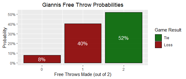
This will return a handy dataframe with the probability densities for making 0, 1 or 2 out of 2 free throws based on Giannis' historical free throw percentage.

But raw dataframe's are no fun. Let's spice it up with a nice ggplot visual.
This was created from the following code.
ggplot(data = data, aes(x=free.throws.made, y=probs, fill=game.result)) +
  geom_bar(stat="identity", color="black", alpha=0.9) +
  geom_text(aes(label=percent(probs)), position=position_stack(vjust = 0.5), color="white", size=4.5) +
  scale_fill_manual(values=c("#8B0000", "#006400")) +
  xlab("Free Throws Made (out of 2)") +
  ylab("Probability") +
  ggtitle("Giannis Free Throw Probabilities") +
  scale_y_continuous(labels =function(x) return(percent(x, accuracy=1))) +
  theme(plot.title = element_text(hjust = 0.5)) +
  guides(fill = guide_legend(reverse = TRUE)) +
  labs(fill = "Game Result")
We can see that a more accurate probability of the Buck's tying the game is 52%, markedly lower than his overall free throw percentage. Giannis ended up only making one of two, which had 40% chance of happening under our modeling, and the Buck's fell to the Celtics;
ESPN gave Giannis a bit of rough time the next morning; however, given our newfound knowledge of the binomial distribution, we can give Giannis a break for missing since it was basically a coin flip!